

Tripal is a combination of social media and travel information. Utilizing user data to provide a custom tailored travel planning experience.
PROJECT GOAL
• Streamline travel planning experience
• Provide a multi function travel planning platform
• Quick access to friends and travel notes
• Enable collaborative trip planning in real time
my role
I planned, drafted and conducted interviews and surveys, documented meetings, created and delivered final presentation. Build app prototype based on research.
Striving to understand the core and urgent needs of users in a wide range of travel industry, I utilized different research methods along the process to create a complete picture of this opportunity space, and decided on the most suitable methods at that time based on the current stage, audience and resources.

Surveys are kept short, stay focused on one topic, and contain a mix of closed- and open-ended questions. If a survey has too many closed-ended questions, you may not gather enough context. If it has too many open-ended questions, your participants may tire and abandon it completely.


The integration of user interview information helps to summarize and summarize what different groups of people face in the whole journey.
I synthesized the research into user profile to pinpoint the core goals and challenges and inform stakeholders.
Hear
Say and do
See
Think
What I learn based on above research is most of travelers like to do some planning before traveling, but tired of gathering travel information from different platforms and compiling. They mainly rely on travel-pro friends or local friends when they select the travel notes. For them, the advice of people they know is much more credible than that of unknown sources.
Tripal is an app which provides users the convenience of efficiently collecting, communicating, and storing, of trip planning details, all in one location, sourced from direct and second degree contacts. The goal is to minimize app switching during the trip planning process.

Complete User Flows
.jpg)
From low-fi to hi-fi, my design evolved with constant feedback from users and stakeholders.


Through repeated user testing to understand user habits and the priority of options. This part is the most important step to transform the results of previous research into design application. More detailed user testing can lead to the most practical design. Take into account as many details as possible to avoid making big changes after the next step of UI design
the space above search bar is too empty
need a navigation bar
unclear about what is “your notes” about
what recommended travel notes is based on
two icons without label is confusing
need “add” new folder feature
recommended is better sort by most popular
avatars on lower right corner of each card are confusing
save in default folder
chat icon is usually at upper right corner
layout should be the same as home page card
upper left corner icon is unclear
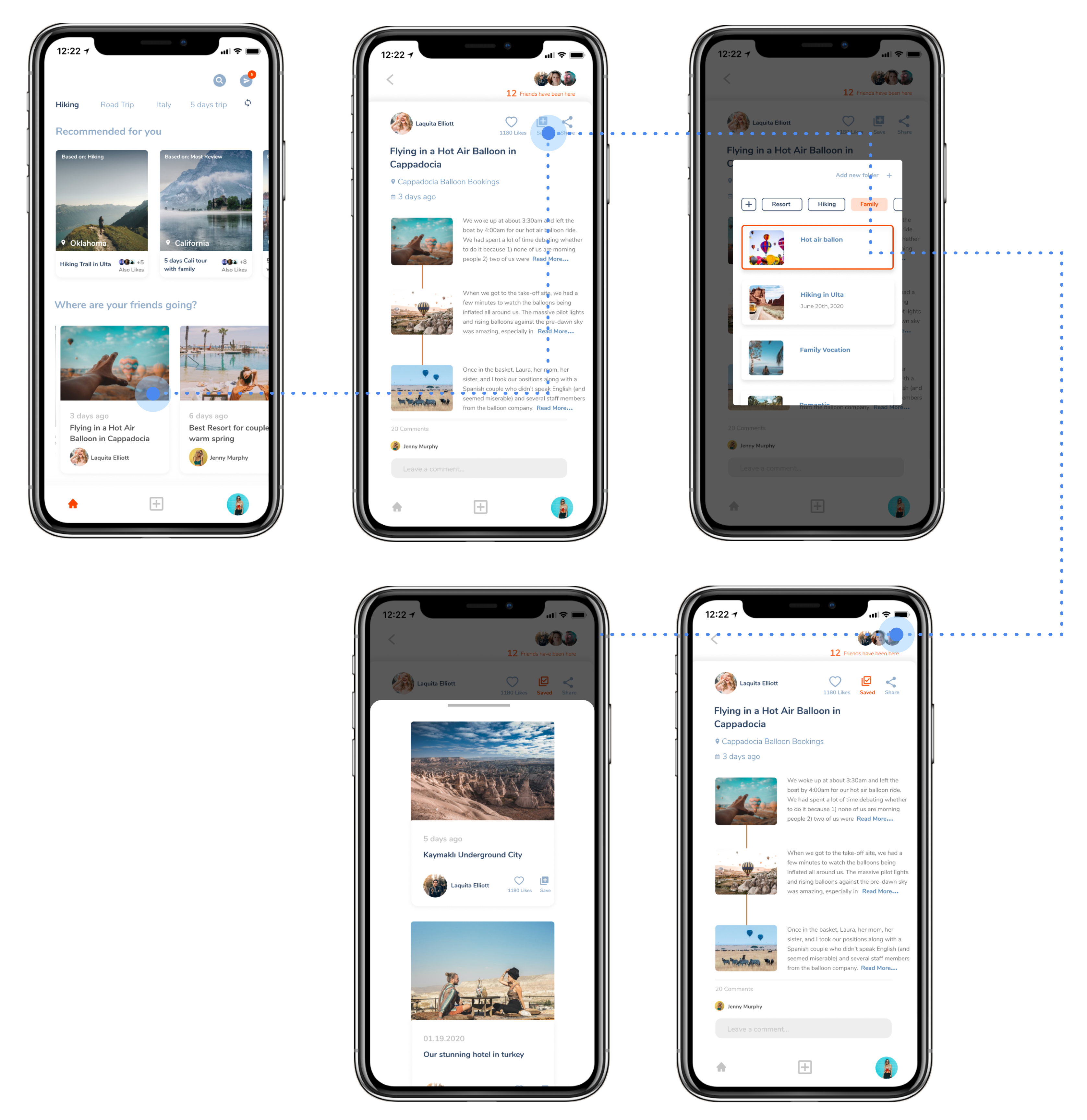
Move the Search and Message icons to upper right area, based on user feedback. By adding location, resource and other information, users can filter the content they are interested in more quickly and conveniently.

Reduce confusion by adding labels to “like” and “save” functions. The layout of the post is organized by itinerary to help users understand friends' itinerary more easily, and help the original poster to manage their posts more easily.

The notification function allows the user to know the changes in the saved notes folder as soon as the page is opened. Display “like” and friend counter to encourage users to post. More clarity in editing itinerary with friends feature.

The function of adding folders and labels has been added, so users can have various functions of saving notes and easily manage on one page.
Laura wants to travel in the near future, but the destination has not been determined. Want to know where other friends are traveling recently as a reference.
Janet wants to post her just finished travel experience and see if any of her friends like it or comment it.

Blue is the most popular color in travel photos. It represents the sky as well as the sea. It gives people a sense of pleasure and relaxation on holiday. Bright and passionate orange represents the beach and sunshine, and also makes this logo have more pop and contrast among other travel apps.


Finding the problem of a user's need from the extensive travel market was an extremely steep learning curve. It was an great experience that taught me a lot about being lean and knowing when and where to focus your energy and efforts.
Some key takeaways from this project are:
Drafted and conducted interviews and surveys, created and delivered final presentation. Build travel app prototype based on research.

Redesign app according to brand analysis, user surveys. Including user research, usability testing, prototype animation.


